Longridge Golf Club has been part of the local sporting landscape since 1877. With unbeatable views, a passionate membership, and a rich community spirit, it had everything a modern club should offer – except a modern brand. The identity felt fragmented, outdated, and didn’t reflect the inclusive, welcoming, and high-quality experience they delivered every day. They weren’t looking for a revolution. They just needed the right evolution.
A brand built on history, driven by passion
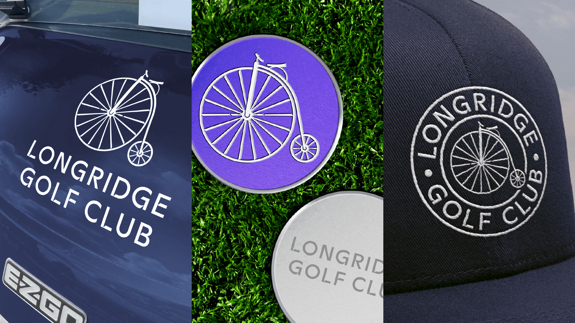
We partnered with Longridge Golf Club to evolve their identity into something that could honour their roots and excite new generations of golfers. The club started life as both a golf and cycling club, and that heritage still mattered – so we brought it to life in a fresh, modern way.
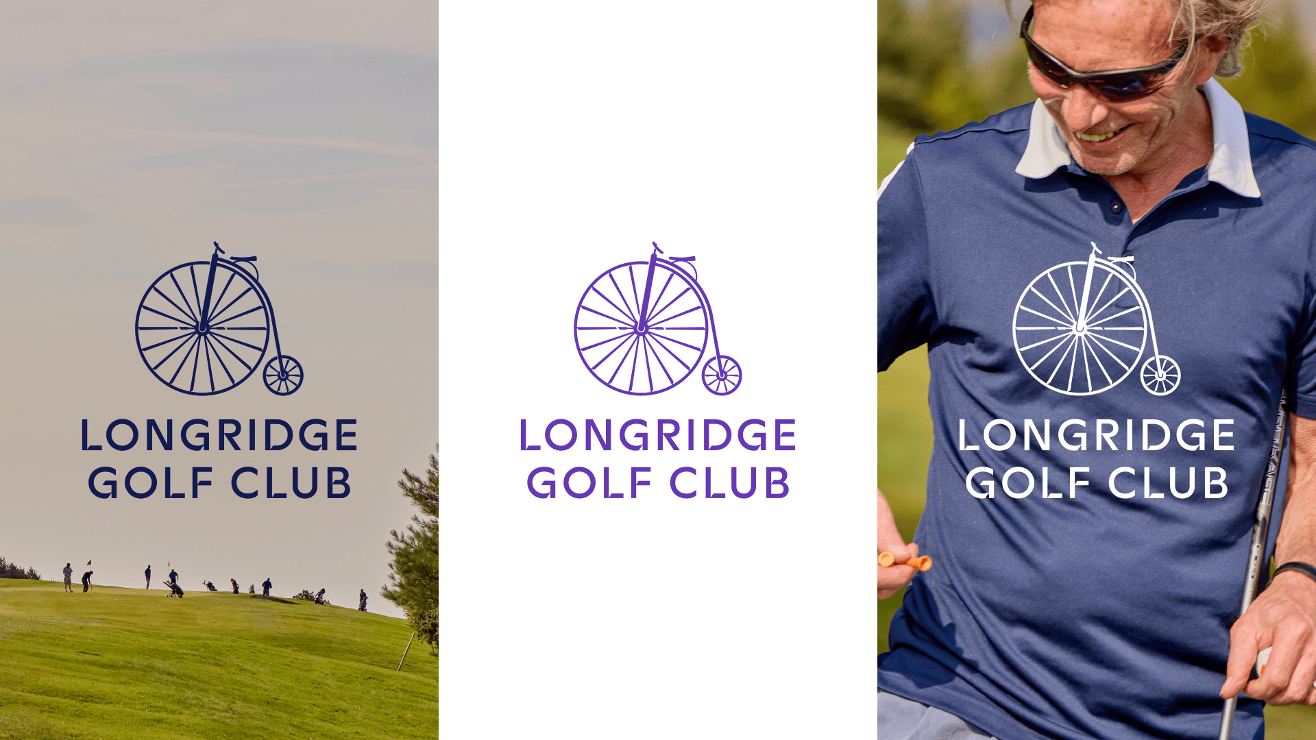
The result? A brand rooted in tradition, but forward-looking in tone, feel, and design. We clarified the brand’s personality, crafted a bold new motto in “Driven by the game, dedicated to the course”, and updated their visual identity to reflect who they really are: welcoming, relaxed, ambitious, and proud to offer one of the best value-for-money golf experiences in the region.
This was a brand made to feel lived-in. Not manufactured. Not corporate. But honest, supportive, and full of community.
From overlooked to proudly authentic
When we began, Longridge’s brand existed mostly in scattered signage and piecemeal communications. It lacked a consistent story. The identity was functional, but not emotional. And for a club with such legacy, heart, and visual appeal – that was a missed opportunity.
So we listened. We mapped the market. We walked the course. We studied what made Longridge different. Then built a brand to express it.
A brand that balances heritage and future
We brought the LGC identity to life across every touchpoint with clarity, consistency, and character.
We modernised the club’s iconic penny farthing brand mark – a subtle nod to their cycling roots – and updated it to feel cleaner, sharper, and more contemporary. Everything from print to signage now reflects the same confident and cohesive look.
We crafted a clear, emotionally resonant brand position that speaks to all current and future golfers. It celebrates Longridge’s long-standing values while opening the door to a broader, younger, and more diverse audience.
Photography & art direction
We developed a bank of imagery that brought the brand to life visually. Real members. Real play. Real emotion. The imagery captures everyday moments on and off the course, inclusive of gender, age, and ability, and aligns beautifully with the club’s welcoming tone.

The result? A brand with pride, purpose and presence
Since launching the new identity, Longridge Golf Club has seen:
> Renewed interest from younger and more diverse audiences
> Clearer storytelling around membership, events, and coaching
> Greater consistency across signage, print, and digital content
> Increased Function Room enquiries due to clearer value messaging
> Strong internal alignment around what the club stands for
What was once a quiet, slightly disjointed brand now feels cohesive, confident, and authentic – ready to grow with its community.
Why it matters
Longridge Golf Club didn’t need a rebrand that erased their past. They needed one that respected it, with a clear focus on the future as well. Now, their brand finally reflects what the club has always been and continues to be: passionate about golf, committed to its members, and open to everyone.